

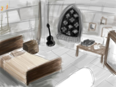
This is my concept that I sketched before I started modelling...
This is how the modelling turned out with finished textures...
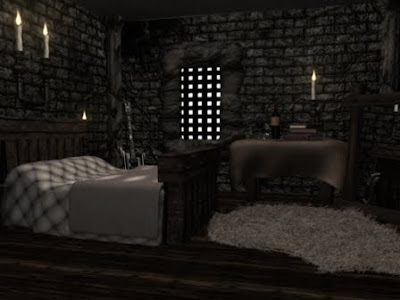
Things I didn't like about this test:
The Lighting:
I didn't like the lighting on this test because it was far too sharp and bright for how I wanted the overall image to look. I also noticed that the back wall is the same colour as the side walls which isn't right.
The Tablecloth:
The texture was fine for this it was just too clean so I added some dirt and a wine stain next to the empty glass.
The Columns:
The texture on these just weren't right, they looked over textured, if that makes sense.
The Ceiling:
This didn't look like it'd been textured at all so I added a much more rocky texture too it and a heavier bump map.
The Guitar:
I was quite proud of my guitar model but wherever I placed it in the scene it just didn't match the theme so it had to go... :(
The Walls:
Overall the walls look great, they just look over-bumped to me so I softened that a little.
The final test...
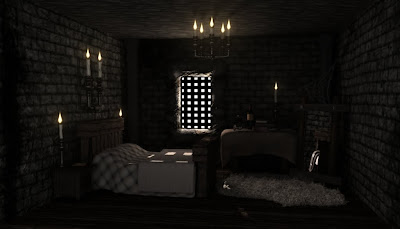
As soon as this finished rendering I knew it looked 100% better. The lighting is much better, the ceiling looks better, the columns don't look crazy!
I only made a few minor adjustments to this, I made the flames smaller and adjusted the lighting a teeny tiny bit.


No comments:
Post a Comment