Thursday, 3 November 2011

Environment/Interior Model

I wanted to do an environment just to show on my show reel that i don't just do characters. I did also consider a vehicle but it turns out they definitely aren't my thing. 


For my environment I wanted to do something that I could go back to for reference and even create my own textures to make it look exactly the same if not better. 


I decided to use my parents Conservatory as it involved both interior modelling and lighting as well as exterior which would be the garden, it also gave me a lot of challenges with the multiple windows which I liked.


This is one of the millions of photographs I have taken of the conservatory and the garden. I liked this view as it's kind of framed by the doorway, the candle and the plant.


 This is a painting I did of the view to get my head around where everything was placed. When I model this I will have all the blinds up so that the garden can be seen as behind these windows is a fence with lots of plants and flowers growing up it.


I am going to model this very realistically however i will make a few changes as I think the garden as it is would make for a boring model, I've also decided to cut out the washing line.

To add some extra life to my model I am going to have a flame on the candle and possibly have the TV and the ceiling fan on.

Character Concept - Murphy and Dan

This is a model I have been wanting to do for a while, it's of my boyfriend Dan and our dog Murphy. I have so many drawings of Dan but the one below is my favourite and so I decided to use that to create some concept work for a model.


This is the concept I came up with it's very simple, cute and colourful.


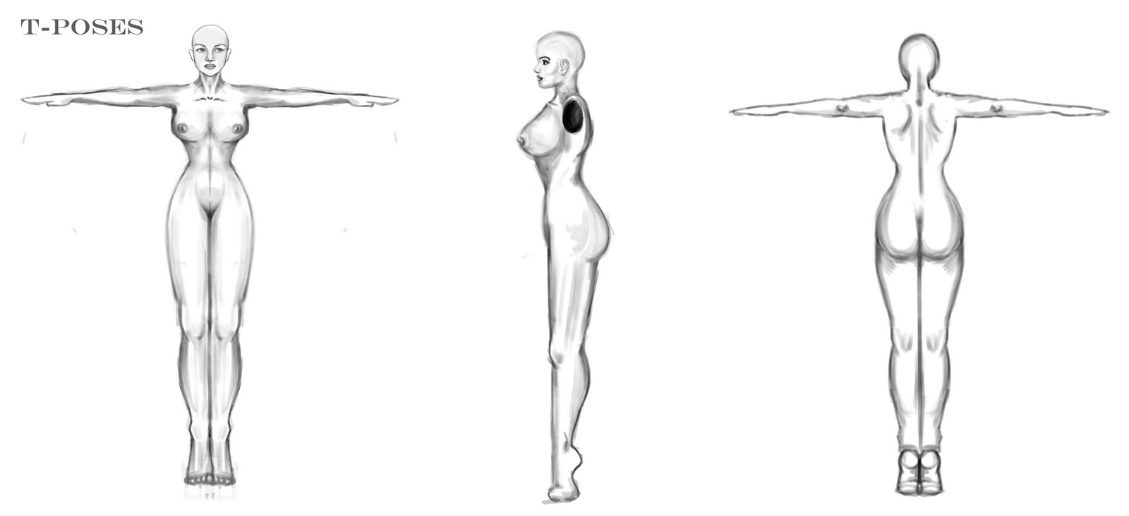
Here are the T-Poses I created for use as Image planes, some of them need tweaking as they don't match up exactly.


Character Concept - Wilberforce

This is Wilberforce! I created this character after finding the name on a computer game and it instantly made me think of this cute little geeky lad. I also wanted to create something fun and not so realistic in Maya.


I am also considering giving him a 2nd personality which is a superhero called Wilberforce and the small boy would simply be Wilber.

Character Concept - Female


This is a 40's/50's style female character that I will eventually model in Maya and animate slightly for my show reel. For the final product I am hoping to add in some smoky effects from her cigarette.


This model will be created in Maya and Zbrush and will be as realistic as possible. I wanted to create a 50's style model to avoid making a common "Page 3" style character that appears in so many games and films nowadays. I have also decided to make her slightly fatter in Model form as her waist is incredibly thin.

Friday, 13 May 2011

The Finished Product

This is the finished render of my scene with sound...


There are a few things that I want/need to adjust for the festival, such as...

- The rug..I am so disappointed that I didn't notice this sooner. After about 3 days of rendering I was gutted when I saw this. I am not even sure what caused it as when I checked my frames in maya and rendered out some stills of the same frames, the fur is there so I'll have to look into that.

- Leaves & Clouds...Unfortunately I didn't realise that the big red cross on my cloud/leaf renders was permanent unless you pay out $200 for it so I had to finish it without these, however I think the window scene definitely needs something outside that window.

- The Night Sky...I thought this would look better than a boring back wall but I think for the festival I will put the wall back in and create the credits in some engraved text.

- The strange big white spot on the mirror...I don't know what that is. I tried moving the camera around, moving the mirror around etc. Nothing would get rid of it.

Here is a wireframe playblast of the scene, without smooth.


Thanks :)

Bedroom Tests...

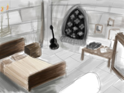
This is my concept that I sketched before I started modelling...


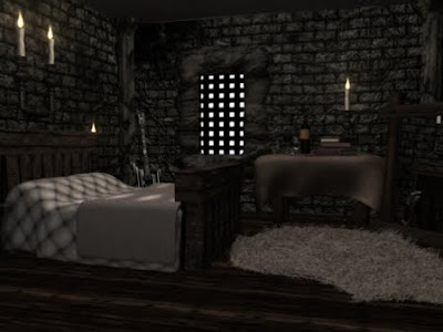
This is how the modelling turned out with finished textures...


Things I didn't like about this test:

The Lighting:
I didn't like the lighting on this test because it was far too sharp and bright for how I wanted the overall image to look. I also noticed that the back wall is the same colour as the side walls which isn't right.

The Tablecloth:
The texture was fine for this it was just too clean so I added some dirt and a wine stain next to the empty glass.

The Columns:
The texture on these just weren't right, they looked over textured, if that makes sense.

The Ceiling:
This didn't look like it'd been textured at all so I added a much more rocky texture too it and a heavier bump map.

The Guitar:
I was quite proud of my guitar model but wherever I placed it in the scene it just didn't match the theme so it had to go... :(

The Walls:
Overall the walls look great, they just look over-bumped to me so I softened that a little.


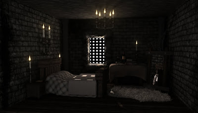
The final test...


As soon as this finished rendering I knew it looked 100% better. The lighting is much better, the ceiling looks better, the columns don't look crazy!

I only made a few minor adjustments to this, I made the flames smaller and adjusted the lighting a teeny tiny bit.

After Effects

This is everything I created in After Effects.

Title:

This is going to be the title page, some fancy old style text will write itself on to the paper before rolling up and revealing the animation underneath.

Sky:

This is the first sky test. I needed some sky to be visible through the window during the animation and I did't want it to be still so I rendered out a quick animation from Maya using MR Sun&Sky.
I didn't want the sun to be visible so I got rid of that and also lowered the horizon.


Leaves:

These leaves are going to be visible through the window n the first scene through the window. Made using the Trapcode Particular Plugin.

Clouds:

Rendered using Trapcode Particular in After Effects.


I will also create my credits in After Effects but I haven't done this yet.